


Top Banner Design Ideas for Successful Business Promotions
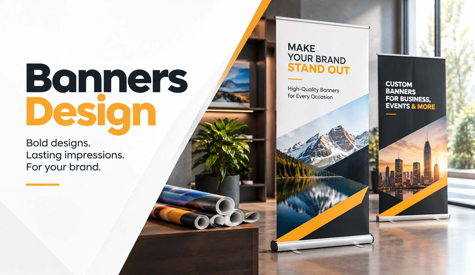
A business banner can have plenty of space and still fail to communicate anything useful. We often see designs packed with headlines, phone numbers, product images, discounts, icons, and background graphics, yet customers struggle to understand the main message from a few feet away. Good banner design does not start with decoration. It starts with deciding what someone needs to notice first.
Whether a business needs storefront signage, an event banner, a trade show display, or an outdoor promotion, the same principle applies. People usually see banners while walking, driving, shopping, or moving through an event. They rarely stop to study every detail. A well-planned Banner Design therefore needs a clear visual hierarchy, readable typography, relevant imagery, and enough breathing room to make the message easy to absorb.
The strongest business banners do not try to say everything. They communicate one useful idea quickly and support it with thoughtful design choices.
Why Banner Design Matters for Business Promotions
A banner often becomes one of the largest visual pieces in a marketing campaign. That size creates opportunity, but it also exposes weak design choices. A small readability problem on a computer screen can become a major issue once the artwork reaches several feet in width.
We recommend treating promotional banners as communication tools rather than oversized advertisements. Before choosing fonts or colors, businesses should decide what they want viewers to understand within the first few seconds. That decision should guide every design element that follows.
Start With One Primary Message
Every banner needs a clear communication priority. A restaurant may want to announce a grand opening. A retailer may want to promote a seasonal event. A trade show exhibitor may simply need attendees to understand what the company does.
Problems begin when businesses give five messages equal importance. A banner that promotes a sale, explains services, lists several locations, includes social media handles, and introduces the company rarely gives viewers a clear starting point.
Choose one main message and let supporting information play a secondary role.
Design for the Viewing Environment
A banner inside a reception area works differently from one facing passing traffic. Indoor banners allow viewers more time to read, while roadside and storefront banners need much faster communication.
Before designing, consider viewing distance, traffic speed, lighting, installation height, and surrounding visual distractions. These practical factors influence font size, image detail, contrast, and how much information the banner can realistically carry.
Use Bold Typography Without Overloading the Layout
Typography does much of the heavy lifting in successful banner advertising. If customers cannot comfortably read the headline, strong photography and attractive colors will not rescue the design.
We usually recommend limiting the number of typefaces and creating contrast through size and weight instead. One strong headline font paired with a clean supporting typeface often creates a more professional result than several decorative fonts competing for attention.
Make the Headline Easy to Scan
Short headlines work especially well for promotional banners because people can understand them quickly. Instead of writing a full sentence, businesses can often communicate the same idea with five or six carefully chosen words.
For example, a local service business may benefit more from a clear service statement than a clever slogan that requires interpretation. Clarity usually matters more than wordplay when viewing time remains limited.
Keep Important Text Away From the Edges
Designers sometimes place text too close to trim areas, hems, pole pockets, or hardware. That choice can create problems during finishing or installation.
We recommend using comfortable safe margins around headlines, contact details, and calls to action. Proper spacing also makes the layout feel more polished and prevents the banner from looking crowded.
Build Strong Color Contrast for Faster Recognition
Color can attract attention, reinforce branding, and guide the viewer toward important information. However, more color does not automatically create more impact.
Successful banner design usually relies on a controlled palette. Brand colors can establish recognition, while one contrasting accent can highlight a headline, offer, or important visual element.
Prioritize Readability Over Decoration
Light gray text on a white background may look refined on a monitor, but it often loses visibility when printed at large scale. Similar problems occur when designers place text over busy photographs without enough contrast.
Dark text on a light background or light text on a dark background generally creates stronger readability. When text sits over photography, consider a clean open area in the image or a subtle background treatment that improves separation.
Think About the Surrounding Environment
A banner should not disappear into its surroundings. A dark banner against a dark storefront may lose impact, while a carefully contrasted design can stand out without looking aggressive.
Businesses should also consider lighting conditions. Bright sunlight, indoor spotlights, nighttime illumination, and reflections can all affect how colors and details appear in real-world use.
Use High-Quality Photography That Supports the Message
Images can communicate faster than paragraphs, particularly when businesses promote products, food, real estate, events, travel, or visually driven services. However, image quality becomes especially important in large-format printing.
A photograph that looks sharp on a social media post may not contain enough image data for a large banner. Stretching a small file can create visible pixelation, softness, or artifacts once printed.
Match Images to the Actual Promotion
Generic stock photography often creates a disconnect between the business and the offer. When possible, businesses should use visuals that closely represent the product, environment, service, or customer experience they actually want to promote.
The image should support the headline instead of competing with it. If viewers notice the photograph but still cannot understand the promotion, the visual has taken too much control of the layout.
Start With the Best Source Image Available
Source quality matters before banner production even begins. Businesses working with professional photography, archived film, artwork, or high-value visual assets should start with the cleanest possible digital file.
For campaigns that rely on film photography or archival originals, understanding drum scanning for prints can help explain why capture quality influences final reproduction. Better source material gives designers more flexibility when preparing large-format graphics.
Keep Banner Layouts Simple and Purposeful
Whitespace can feel uncomfortable to businesses that want to use every available inch, but empty space performs an important job. It separates information, improves visual hierarchy, and helps the viewer identify the most important element.
A professional banner does not need something in every corner. In many cases, removing unnecessary elements improves the design more than adding another graphic.
Follow a Clear Visual Order
A viewer should know where to look first, second, and third. A practical hierarchy might include the headline first, the primary image second, and essential supporting information third.
Size, positioning, contrast, and spacing can create this order naturally. Designers should not rely on arrows, bursts, boxes, and decorative shapes unless those elements genuinely improve communication.
Avoid the Common “Everything Bigger” Mistake
When every element becomes large, nothing feels important. Oversized logos, oversized headlines, oversized phone numbers, and oversized product images can make a banner look chaotic.
Instead, create one dominant element and allow the remaining content to support it. This approach gives promotional signage a more confident and professional appearance.
Choose Banner Ideas That Match the Business Goal
Different promotions require different design approaches. Businesses should select a banner style based on where the banner will appear and what action they want viewers to take.
A trade show booth, retail storefront, community event, and construction site may all need completely different visual priorities.
Storefront Promotional Banners
Storefront banners work well for openings, seasonal campaigns, special events, new services, and temporary announcements. The strongest designs usually feature a short headline, clear branding, and limited supporting information.
Pedestrians may have slightly more reading time than drivers, but simplicity still matters. Avoid turning the banner into a printed version of an entire website homepage.
Event and Trade Show Banners
Trade show banners need to work in visually crowded environments. Companies often compete with neighboring booths, screens, signs, lighting, and people moving in multiple directions.
A concise value proposition, strong visual identity, and one relevant image can work better than a long explanation. Visitors can ask questions once the banner earns their attention.
Product-Focused Business Banners
Businesses promoting a physical product should give the product enough visual importance. Clean product photography, uncluttered backgrounds, and a short benefit-led headline can help customers understand the offer quickly.
Avoid filling the composition with several unrelated products unless the promotion specifically covers a range or collection. A single clear focal point usually creates stronger visual impact.
Outdoor Business Banners
Outdoor banners need strong readability and practical durability. Designers should reduce fine detail, use larger typography, and account for viewing distance.
Businesses should also discuss finishing requirements before approving artwork. Grommets, hems, pole pockets, wind conditions, installation method, and banner material can influence both the design area and final production setup.
Make Calls to Action Clear Without Making Them Aggressive
Not every promotional banner needs a strong sales command. The appropriate call to action depends on the campaign.
A grand opening banner may simply display the opening date. A trade show banner may direct visitors toward a conversation. A retail promotion may highlight a website or in-store offer.
Give Viewers One Logical Next Step
Multiple calls to action create unnecessary decisions. A banner that asks customers to call, scan a QR code, visit a website, follow three social networks, and subscribe can reduce clarity.
Choose the action that best supports the campaign goal. Keep it visible, concise, and easy to understand.
Use QR Codes Carefully
QR codes can work well in indoor displays, event banners, reception areas, and other locations where viewers can safely stop and scan. They make less sense on banners that people mainly see while driving.
Businesses should also leave enough clear space around the QR code and test the final printed size before production. A code that works on a computer screen may not work equally well from the intended viewing distance.
Prepare Artwork Correctly for Banner Printing
Even a strong creative concept can suffer when the production file contains technical problems. Banner printing requires more than enlarging a small graphic and exporting it as a PDF.
Print-ready artwork should account for dimensions, image quality, fonts, color handling, safe zones, bleed requirements, and finishing specifications.
Design at the Correct Proportions
One common production mistake involves creating artwork at the wrong aspect ratio. If the finished banner needs a wide format, designers should build the artwork to the same proportions from the beginning.
Forcing a square or vertical design into a horizontal banner often causes awkward cropping and distorted spacing.
Check Images Before Enlarging Them
Image resolution requirements depend on final size and expected viewing distance. Large-format graphics do not always require the same pixel density as small printed pieces, but extremely low-resolution files still create poor results.
We recommend checking source images at the intended output dimensions rather than judging them only by how they appear on screen.
Keep Critical Content Inside Safe Areas
Finishing can reduce the usable design area near the edges. Important information should remain comfortably inside the safe zone, especially when the banner requires hems, grommets, or pole pockets.
Planning these details before design approval reduces last-minute layout changes and protects important content during production.
Maintain Brand Consistency Across Promotional Materials
A business banner should look like it belongs to the same company as the website, brochures, business cards, packaging, social media graphics, and other customer-facing materials.
Consistency does not mean making every marketing piece identical. It means maintaining recognizable visual cues such as typography, core colors, image style, logo treatment, and overall tone.
Create a Repeatable Banner System
Businesses that run promotions throughout the year can benefit from a flexible design framework. A repeatable system might establish headline placement, logo position, type hierarchy, brand colors, and photo treatment while allowing campaign-specific content to change.
This approach saves design time and helps customers recognize the business across different promotions.
Adapt the Layout Without Losing the Brand
A holiday sale banner may use more energetic imagery than a corporate event banner, but both can still share the same visual identity.
Strong branding creates consistency while leaving enough flexibility for different audiences, environments, and promotional goals.
Review Banner Designs From the Viewer’s Perspective
Designers naturally spend time examining banners up close on large monitors. Customers rarely experience them that way.
Before approving the design, reduce the artwork on screen or move farther away from the monitor. Ask whether the headline still reads clearly and whether the primary message remains obvious.
Use the Three-Second Test
Look at the design briefly, then look away. Ask yourself what you remember.
If the main message, brand, or offer does not come through quickly, the design may contain too much competing information. Simplifying the layout often solves the problem more effectively than increasing font sizes across the board.
Proof Every Practical Detail
Before sending artwork to print, check spelling, dates, web addresses, phone numbers, pricing, event details, and location information.
A small typo can become very noticeable on a large banner. A final proofing routine protects both the production budget and the business's professional presentation.
FAQS
What Makes a Business Banner Design Effective?
An effective business banner communicates one primary message quickly. Strong typography, clear contrast, relevant imagery, consistent branding, and sufficient spacing help viewers understand the promotion without unnecessary effort. The design should also match the viewing distance and physical environment.
What Information Should a Promotional Banner Include?
Most promotional banners need a headline, brand identification, essential supporting information, and one clear next step. The exact content depends on the campaign. Businesses should remove information that viewers do not need immediately rather than trying to fit every service or contact channel onto the banner.
What Is the Best File Format for Banner Printing?
PDF files often work well for print-ready banner artwork because they can preserve vector graphics, text, and layout information. However, production requirements can vary by printer. We recommend confirming the required dimensions, color settings, bleed, safe area, and file specifications before preparing the final artwork.
How Do You Make a Banner Easy to Read From a Distance?
Use short headlines, large type, strong color contrast, simple backgrounds, and clear spacing. Avoid thin fonts and long paragraphs. The farther away viewers stand, the less detail they can comfortably process, so designers should simplify the message as viewing distance increases.
Conclusion
Successful banner design comes from disciplined communication rather than adding more graphics. Businesses need a clear message, readable typography, appropriate color contrast, strong imagery, thoughtful spacing, and artwork that suits the final viewing environment. Production details such as resolution, dimensions, finishing, and safe margins also deserve attention before the file reaches print.
We recommend reviewing each banner from the customer's perspective. Ask what they will notice first, what they will understand within a few seconds, and what action makes sense next. That simple review can uncover crowded layouts, weak hierarchy, unclear messaging, and unnecessary content before production begins.
At Laguna Digital , we approach banner projects with both visual communication and print production in mind. If you are preparing business banners for an event, storefront, campaign, or ongoing promotion, start with a focused message and build the design around how customers will actually experience it.

 English
 Russian